Final project
1. I wanted to make another face portrait, but nothing too big, so I decided I should just do half a face.
2. This was my progress in a few days. I'm really working hard on the ear and the eye. I want those two objects to be the main focus. Right now, I am working on the hair. In my opinion, it doesn't look like human hair, but we'll see how it all turns out.
3. This is my final. If I had just a little more time I could've made it look so much better. In my opinion the face looks dirty, but I like how I did the eye and the ear. I didn't think I could've drawn an ear that looked remotely human, but I'd like to think I did.
2-Point Perspective
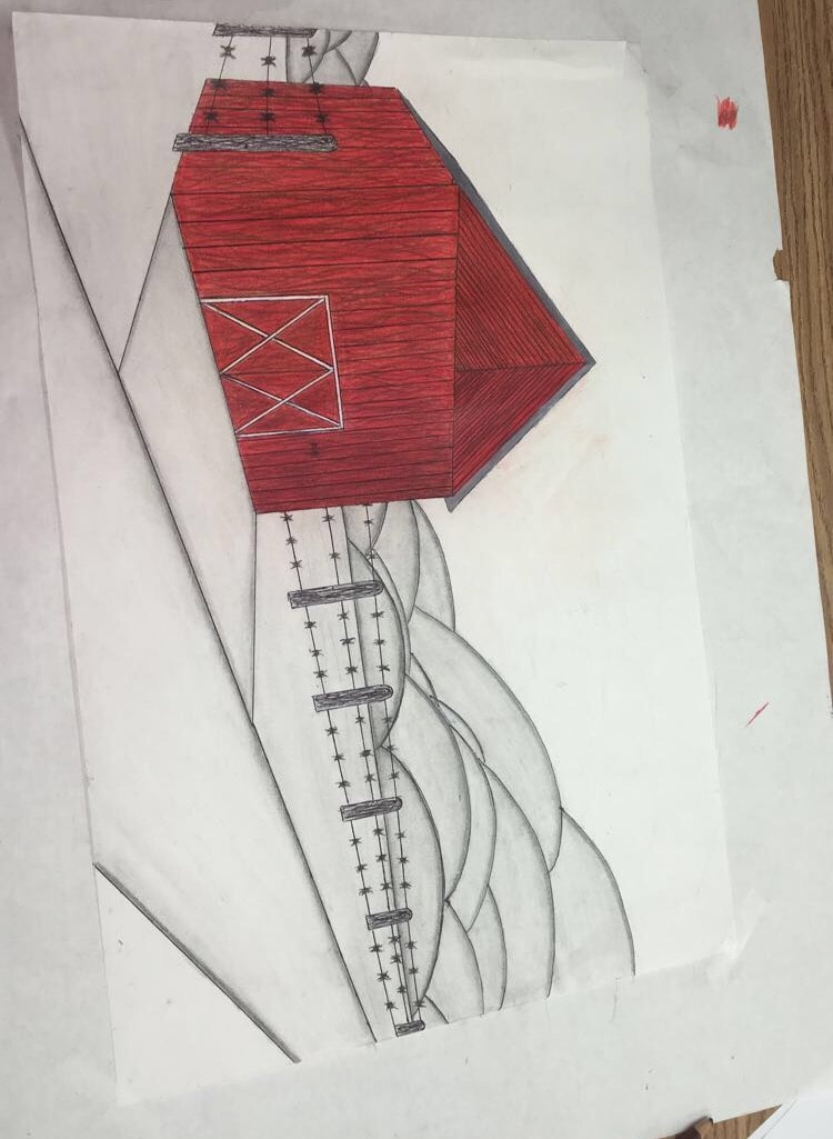
I drew a barn on the side of a country road as seen from a 2-Point Perspective. The land is surround by barbed wire, and in the background are high hills. I like the emphasis of color on the barn, and I tried to make it look like the light is coming in on the west side. So, it's lighter in the front, and darker towards the back.
Alebrije
1. For my sketches I drew two mugs (a raccoon and an elephant) and a turtle bowl.
2. For my useful alibrije I picked the turtle. I thought it was a cute idea because the turtle uses it's shell for a house and I can use the shell in my house (to put things in).
3. I under glazed with green and brown before putting it in the kiln, but the sad thing is one of it's legs broke off. I'm going to fix it, and then my reptile will be complete.
Abstract - oil pastel
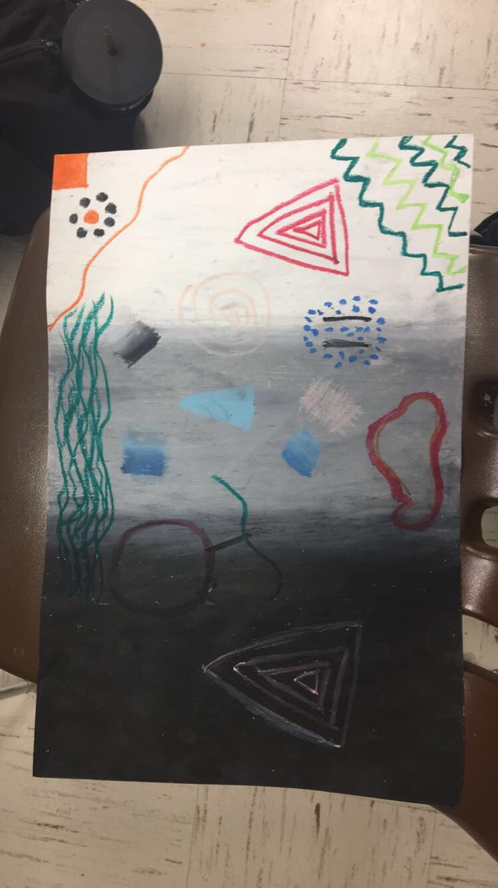
The first thing I did was make a gradation out of the colors I wear all the time for the background. Then, I just followed the steps and ended up with abstract art. I wish I would've had better colors to work with, I feel like it looks a little dull. I also wish colors could show up bright on the dark color black, but that's okay.
self portrait
1. This is my first drawing, Fielder said to draw you best face and that's really all I could think of to do.
2. And this is after Fielder showed us step by step how to draw a realistic human face. I think the mouth is a little too big and that the eyebrows are too small. I had to shrink the forehead and cover it up with hair because it was huge. Speaking of the hair, I really need to practice on it.
3. I've worked on the face forever, and I feel like there's so much more to do but I've got to move on with the project. I think I messed up on the pupils and the eyelashes don't look real enough. To fix that, for 2/3 of my symbols I'm going to color my eyelashes black and my eyes blue. The lips are really frustrating me, because I don't think they look like mine. The eyebrows need to look more realistic and maybe thicker. I'll see what I can do.
4. I am now working on my hair, I'm going to try and fix the face later. I couldn't figure out whether to do straight or curly, so I'm going to do mostly straight with little waves.
5/6. Picture 6 is the finished look. I wish I had another week to do this, because I didn't doa background and didn't shade/highlight parts of my face. My favorite part has to be the eyes (excluding the eyelashes). I didn't know if I would like just the eyes popping out, or add in a blue shirt to tie it together. I think I like the color better. My second favorite thing would be the lips, I don't know if they look like mine but I like them, and if I had more time I might've made it look like I was smiling a little bit than just a straight face.
Symbols -
1. Eyelashes - I wear mascara everyday.
2. My eyes/eye color - I've been told my eyes are a really pretty blue.
3. My necklace - Someone very special to me gave me this as a present, and I wear it almost every day.
Final project
1. This is my progress in about a week. There is so much more to do in so little time.
2. Keep in mind, I struggled very much with this project, but I stuck through it. This is the finished look.
2. Keep in mind, I struggled very much with this project, but I stuck through it. This is the finished look.
close up value drawing
1. This is the picture I'm going to try and draw in color.
2. This is the picture in black and white.
3. This was my progress in a week. Yes, I know the bottom lip is messed up and doesn't look right, but I'll be coming back to it. I'm working on the lip stick tube right now.
4/5. Comparing this to my 3rd picture is unbelievable. This was done in under a week and I cannot believe it went from that to this.
6. This is just comparing the original photo and my drawing. I still need to find the right color for the lipstick and hopefully I'll do that tomorrow.
7/8. I finished my project, and this is what it looks like. I honestly think the black and white looks better than the the colored. I could've done better shading on the lipstick tube, and maybe a little on the lips themselves.
PRINTING
I created two testers for a printing design used on a printing press.
1. This is one piece, I took my pencil and just went back and forth, back and forth carving lines in it, then just covered the whole thing with glue. This is before the glue dried down.
2. My other tester I put glue in random lines, then pt string in different ways on the glue. In this picture it is lacquered.
3. For my first tester, this is the relief print.
4. For my first tester, this is the intaglio print.
5. For my second tester, this is my relief print.
6. For my second tester, this is my relief print.
7. This is my finished plate...
8. Except this plate was ruined...
9. When I printed this one.
10. So I had to make another one, and made this design.
11-18. I printed out so many prints I lost count, and I had to pick ten good ones. These are nine of them.
19. This is the one I chose as my favorite, or one of them.
creating A Sketchbook
1. I glued down my cover over the pieces of cardboard, then I had to put my end pages on my book, so I glued the paper down making sure it had holes in it.
2. Then, I had to put in my signatures, making sure my orange colored piece of paper was right in the middle.
3/4. Again, I made sure all of the holes were the same in every signature, and in the end pages. After that I started sewing in the string to hold everything together. Through the pages, through the spine, back through the other whole in the pages, then tie it together.
5/6. This is what everything looks like after I glued the cover down, the end pages to the cover, and sewed signatures into the sketchbook.
7. Since my sketchbook was basically all white and orange, I decided to paint my cover warm colors: red, orange, and yellow. (I mixed read and yellow to make that orange.)
